5 Design Trends With Staying Power
Popular photos on Houzz from 10 years ago
reveal details that might never go out of style
We looked back at some of the most popular photos from the early 2010s to see which design details are still going strong years later. We found five looks and features that stood out. Perusing these rooms just might give you the inspiration to create a home now that you’ll never grow tired of.
1. White Kitchens
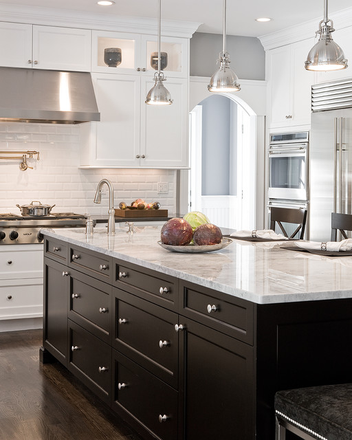
This one was no surprise. Houzz data repeatedly show that most people want a kitchen with white cabinets, a white backsplash and white countertops. And this kitchen by designer Venegas and Co. is a good example of why. Created in 2011, it still feels fresh and timely. The contrasting black island, wood floor and stainless steel finishes create an elegant, classic look that will impress for years to come.
This one was no surprise. Houzz data repeatedly show that most people want a kitchen with white cabinets, a white backsplash and white countertops. And this kitchen by designer Venegas and Co. is a good example of why. Created in 2011, it still feels fresh and timely. The contrasting black island, wood floor and stainless steel finishes create an elegant, classic look that will impress for years to come.
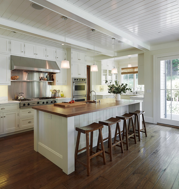
This popular white kitchen from 2012 by Taylor Lombardo Architects features attention to detail on the trim and millwork, something that shows up again and again in popular photos over the years. Quality molding, millwork and craftsmanship almost never go out of style, and incorporating them in your home is a reliable way to add lasting character and charm.
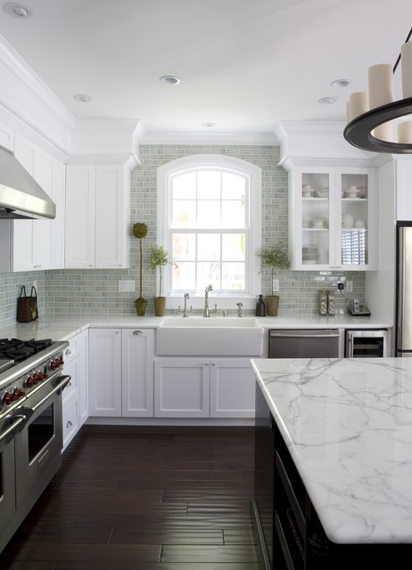
Fiorella Design created this kitchen in 2007. The fresh white cabinets, detailed molding, dark island and flooring, glossy green backsplash tile and other details give it enduring appeal.
2. Calm Contemporary Style
Design photos from a decade ago often look out of date or jarring today because of the flashy patterns and bold colors. In other words, vibes of whimsy and excitement don’t always last, whereas calm minimalism tends to have a longer life.
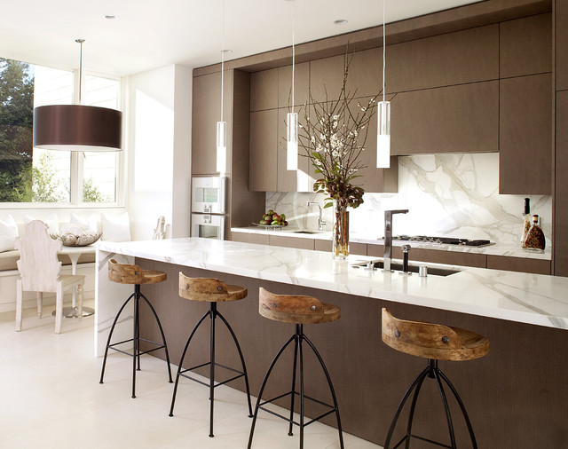
This serene contemporary kitchen by John Maniscalco Architecture, designed in 2011, remains stylish and welcoming. The designer’s reserved use of colors, lines and materials shows the power of simplicity.
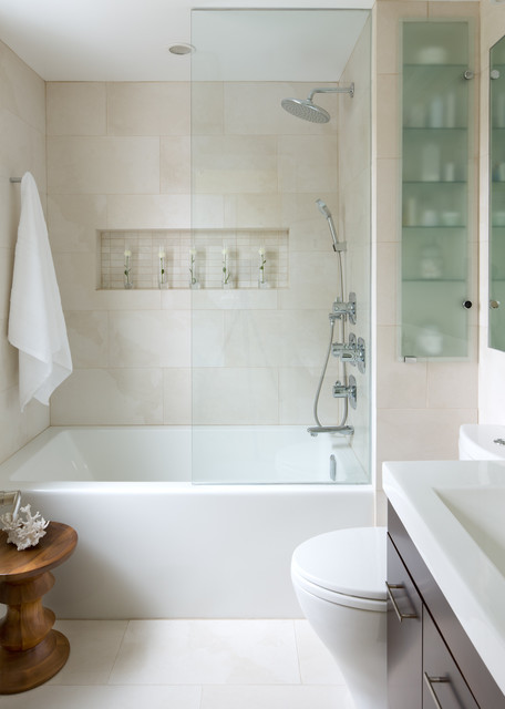
This bathroom by Toronto Interior Design Group from 2012 is another good example. The clean-lined contemporary style and soft palette create a relaxing, spa-like environment — one you’d probably enjoy stepping into decades from now.
3. Hardworking Storage
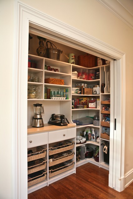
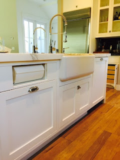
Designer and organizer Marie Newton designed this in 2010. Dedicated, hardworking storage makes a huge difference in how you enjoy a space over time. Working with a designer to take inventory of appliances, utensils and pantry items will ensure you have a place for everything — and having a space that keeps you organized will keep you happy.
Designer and organizer Marie Newton designed this in 2010. Dedicated, hardworking storage makes a huge difference in how you enjoy a space over time. Working with a designer to take inventory of appliances, utensils and pantry items will ensure you have a place for everything — and having a space that keeps you organized will keep you happy.
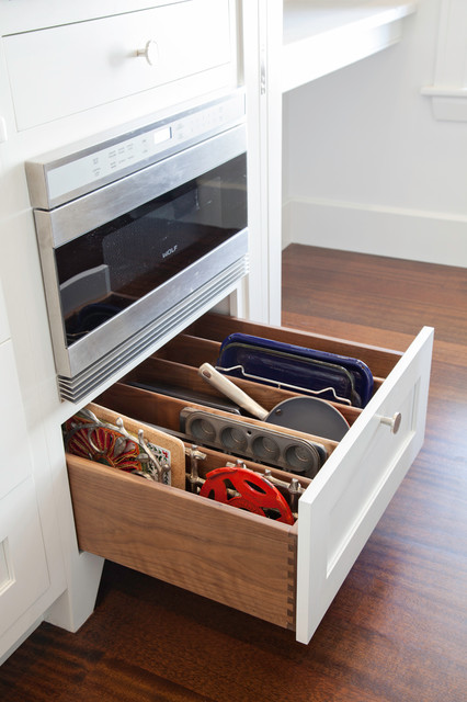
This custom drawer for baking sheets and other items, was popular in 2013 by Pennville Custom Cabinetry.
Hardworking storage isn’t just for kitchens; bathrooms, laundry rooms and entryways also can benefit from dedicated storage solutions. This built-in by Ron Brenner Architects from 2013 shows how providing a place for everything never goes out of style.
4. Traditional-Style Bathrooms
The choices for bathroom tile and other materials can be overwhelming, and homeowners often make a knee-jerk decision they quickly grow tired of. If you’re seeking a relaxing, elegant, long-lasting style, you can’t go wrong by sticking to traditional-style materials and finishes.
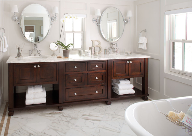
This bathroom, one of the most popular uploaded to Houzz in 2012, illustrates why. The team at Chalet designed a 9-foot-long stained walnut vanity to look like a piece of furniture. It, along with the Calacatta marble countertop and flooring, round swivel mirrors, shaded sconces and light gray painted millwork, helps the room maintain its freshness.
5. Shades of Blue, Gray and Cream
Color is a tricky thing in home design, especially bold, bright, wild and hot colors. Nothing goes in and out of popularity as fast as a vibrant color. In 2010, for example, there seemed to be a craze for purple and green — used together. These days you don’t see much of either, but that will probably change in a year or two.
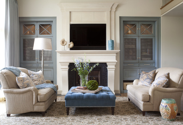
Few colors have held their popularity over the last decade quite like blue, gray and cream. Using this palette — as designers did for this living room, very popular in 2012 — creates a soft and sophisticated look that travels well across styles and decades.
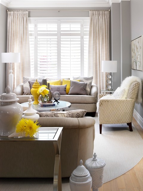
Designer Jennifer Brouwer used shades of gray and cream with pops of yellow in this space, which was one of the most popular living rooms in 2010.
Cabinet-S-Top keeps up-to-date on trends and styles. Speak with one of our designers about your next project.
1977 Medina Road, Medina, OH 44256 ~ 330.239.3630 ~ www.cabinet-s-top.com


Comments
Post a Comment