Color Theory
Written by Amanda Lecky / June,
2015
Overwhelmed by the
prospect of choosing colors for your home? Take some surprisingly simple tips
from top interior designers and create a palette that will please for years to
come.

There’s no other
design element that carries the power of color. “It’s the single most effective
tool in our bag of tricks,” says designer Billy Beson of Billy Beson Co. in
Minneapolis, Minnesota. “Used well, color can infuse a room with personality
and energy, and create any atmosphere you can think of.” And yet, as anyone who
has spent an hour deliberating in front of a wall of paint-store color samples
can tell you, there are few tasks that cause as much confusion and frustration
as picking a palette.

How to simplify the
color selection process? Both Beson and Los Angeles-based designer Nicole
Sassaman suggest starting with a single colorful focal point and then building
the rest of the scheme around that anchor. “For example, if you’re planning to
use a gorgeous rug in your living room, you might pull one of the softer or
more neutral shades from its pattern and use that color on the walls, then
repeat some of the other colors from the rug in your furnishings and
accessories,” says Sassaman. As a general rule of thumb, it’s smart to keep
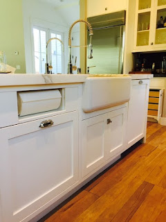
permanant “investment” elements on the neutral side. Stick with classic designs
for cabinets as well as flooring and countertops, such as Cambria in
Waterstone, Marble or the newest Oceanic Collection. Save the more saturated
design choices for items you can change more easily: like paint, accessories,
and artwork.
Color trends
“Hot” hues come and
go—think circa-1970 harvest gold and avocado or the ’80s mauve-and-gray
schemes—so it’s smart to be careful when using these colors. “Use them in small
doses,” says Beson. “Instead of painting your entire house in this year’s
trendy shade, just use it in a small area, like on an accent wall.”
Fortunately, some of
the most on-trend colors right now are also perennial classics. “Navy is very
hot right now,” says Canadian designer Janette Ewen. “But it’s one of those
colors that will still look great ten years from now—it’s a classic that will
really never go out of style.” Beson and Ewen suggest pairing a dark color like
navy with plenty of white, for the most modern look. “The same goes for black”
says Beson.
“A black room can
look very dramatic, but to keep it from feeling constricting, it needs
contrast, so think about deep mouldings and baseboards painted in white or
off-white, and add a little sparkle to the space to reflect light around.”

Gray is also having a
moment. “But not cold, blue-based gray,” says Sassaman. “Look for grays with
warmer undertones, for a more contemporary feeling.” Add energy with
contrasting pops of bold color like orange, hot pink, or yellow.
Living spaces
To figure out which
colors (trendy or not) you gravitate toward, Ewen suggests thinking of the
places that most inspire you and that make you feel happy to think about. “If
that’s a beach in the Caribbean, you might pull sand and sea colors into your
rooms; if it’s an Indian bazaar, you might prefer richer spice tones.” While
there are no hard and fast rules for which colors work best in which rooms, a
general rule of thumb is to choose calming colors like blues, greens, grays,
and lavenders for bedrooms and bathrooms; warmer neutrals for the main living
spaces, such as living rooms and kitchens; and more dramatic hues—rich red,
deep brown, sapphire—for those rooms you spend less time in or use primarily
for entertaining, such as dining rooms and powder rooms.
“Choose your countertops and
appliances first, then pick colors to complement
them, not the other way around.”
— Billy Beson, Billy Beson Co.
appliances first, then pick colors to complement
them, not the other way around.”
— Billy Beson, Billy Beson Co.
Open plans and connectors
Today’s flowing floorplans can cause more color confusion. When
one space connects to another—think of an open kitchen, dining area, and family
room—it can be difficult to know how to choose a color scheme that feels
cohesive and yet helps to differentiate each space. Ewen prefers to keep it
simple. “Don’t try to use wall color to separate the different areas,” she
says. “Choose one complex neutral for the entire space, then let your rugs,
furnishings, and accessories create slightly different color schemes in each
zone.” Billy Beson agrees, adding a suggestion: “An accent wall in a dining
area or on a wall with a fireplace can lend some dimension and create a focal
point in an open plan.” For hallways that link spaces, again head toward
sophisticated neutrals. “We’re really loving silvery, even metallic, shades
right now,” says Beson. “That slight sheen brightens hallways, which are
usually dark, and lends a very subtle glamour.”
Cabinet-S-Top ~ 1977 Medina Road, Medina OH 44256 ~ 330.239.3630 ~ www.cabinet-s-top.com

Comments
Post a Comment