20 Wide-Ranging Colors Touted for 2014
by Jennifer Ott
Behr takes its turn in the color-forecasting game with
4 paint collections from superbold to sophisticated
Rather than tie itself to one top color of the year for 2014 as Pantone,
Benjamin Moore, Sherwin-Williams and Pittsburg Paints have done, Behr has
offered up a whole slew of them. There are 20 colors featured in four
collections: Seaside Harmony, a crisp and modern palette of cool blues and
greens combined with soft warm neutrals; Urban Alternative, a palette of deep,
dramatic and sophisticated hues; Grand Reign, a classic palette that has
old-world charm; and Natural Avocation, a fun mix of superbold hues. I’ve
assembled a few of my favorites below, along with images and tips for how to
work them into your own home.
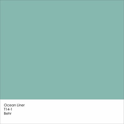
Ocean Liner is from Behr’s Seaside Harmony collection. It’s a
fetching turquoise that has a hint of gray, which gives it a subdued quality.
Note: Due to differences in how interiors are lit and photographed, as well as how computer monitors are calibrated, the colors you see in these swatches and photographs may differ slightly from the actual colors. It’s always a good idea to view actual paint swatches from the manufacturer, or better yet evaluate a large paint sample of the color you are considering, before finalizing your selection.
Note: Due to differences in how interiors are lit and photographed, as well as how computer monitors are calibrated, the colors you see in these swatches and photographs may differ slightly from the actual colors. It’s always a good idea to view actual paint swatches from the manufacturer, or better yet evaluate a large paint sample of the color you are considering, before finalizing your selection.

In this image from Behr, you can see that although Ocean Liner
is quite vibrant, it has a slightly muted quality that allows it to be featured
on all four walls in a room without overwhelming the space with color.

I would pair this watery blue with other hues from nature — a
soft sunshine yellow and a fresh, herbaceous green. Any of these hues would be
terrific on the walls or ceiling, with the other two colors used as accents.

New Shoot is from the Natural Avocation collection and is an
intense grass-green hue. There’s nothing muted about this high-impact shade, so
you might want to use it sparingly as an accent only.

New Shoot might be too intense to use on all four walls, but
it’s a fun accent color, as shown here on the coffee table.

New Shoot requires some neutral hues to tone it down, unless you
are going for a supercolorful space. But neutral doesn’t have to mean white,
beige or gray. A deep, dark, toned-down blue or a supersoft sage are good
choices. The grounding neutrals provide a nice backdrop to the more assertive
bold green.

If Ocean Liner and New Shoot are too bold for you, check out
some of the interesting neutral hues from Behr’s Urban Alternative line.
Increasingly I’m hearing from homeowners who want to move away from expected
shades of white, cream and beige and toward more complex neutrals that have a
mix of brown and gray. Film Fest and Offbeat are two such neutral hues that
straddle the line between warm and cool neutrals.

These warm-cool hybrids really vary throughout the day. In the
cooler morning light they will appear more gray, but will take on a richer,
warmer tone in the warmer afternoon light. The best thing about using a neutral
background hue in a room is that you can add accents of any other color you
like. Or use a variety of neutral hues, as shown here, for a layered look
that’s visually interesting without hitting you over the head with color.

Neutral does not have to mean boring. Mix up your muted hues by
playing with contrast. Consider a light warm or cool neutral as a base, such as
Offbeat or Twilight Gray, and then add a darker neutral, such as Film Fest.
This will give you swaths of varying soft colors, which will offer a bit more
punch than sticking with one neutral throughout the entire space.

This beautiful saturated hue is my favorite of the Grand Reign
colors. Imperial Jewel is a deep garnet that will add a nice dash of drama.

Imperial Jewel works well with a variety of design styles, from
the traditional office space shown here to transitional or contemporary interiors. For a more traditional
look, pair it with warm neutrals and dark wood tones. For a more modern look
pair, it with gray, white and/or black.

Cabinet-S-Top, 1977 Medina Road, Medina, OH 44256 ~ 330.239.3630 ~ www.cabinet-s-top.com

Comments
Post a Comment